Listing Page Redesign
Project Overview
Hepsiburada is Turkey’s second-largest online store offering approximately 180 million products across 32 categories, connecting approximately 50 million members with a growing base of more than 100,700 active merchants.
My Role
I was part of a team consisting of 2 UX Designers, 1 UX Researcher, 1 UX Optimization Specialist, and 1 UX Developer in 2015.
I began my journey as a Mobile UX Designer, however, due to a shortage of designers, I expanded my role to encompass both mobile and desktop projects. This allowed me to gain valuable experience and expertise in designing for multiple platforms. I also utilised Google Design Sprints and guided workshops using Design Thinking methodology ensuring smooth teamwork and effective results.
The Problem
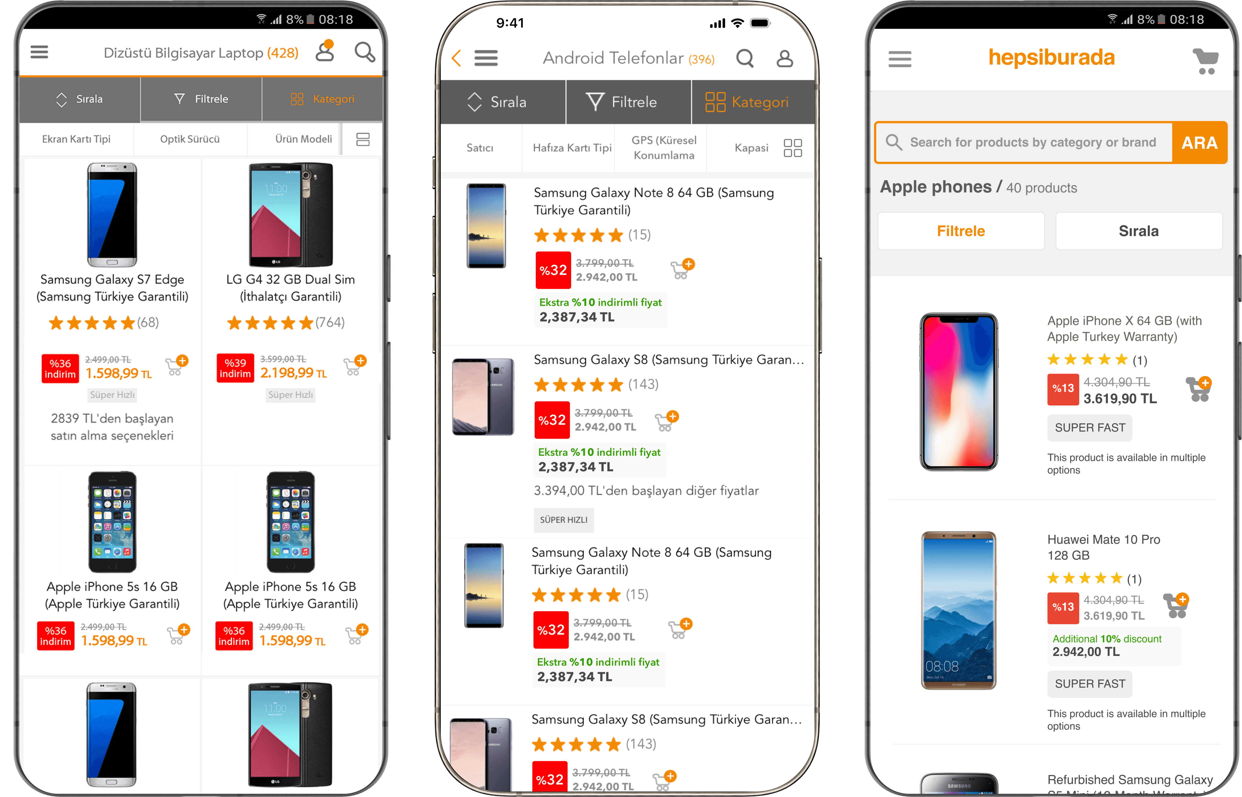
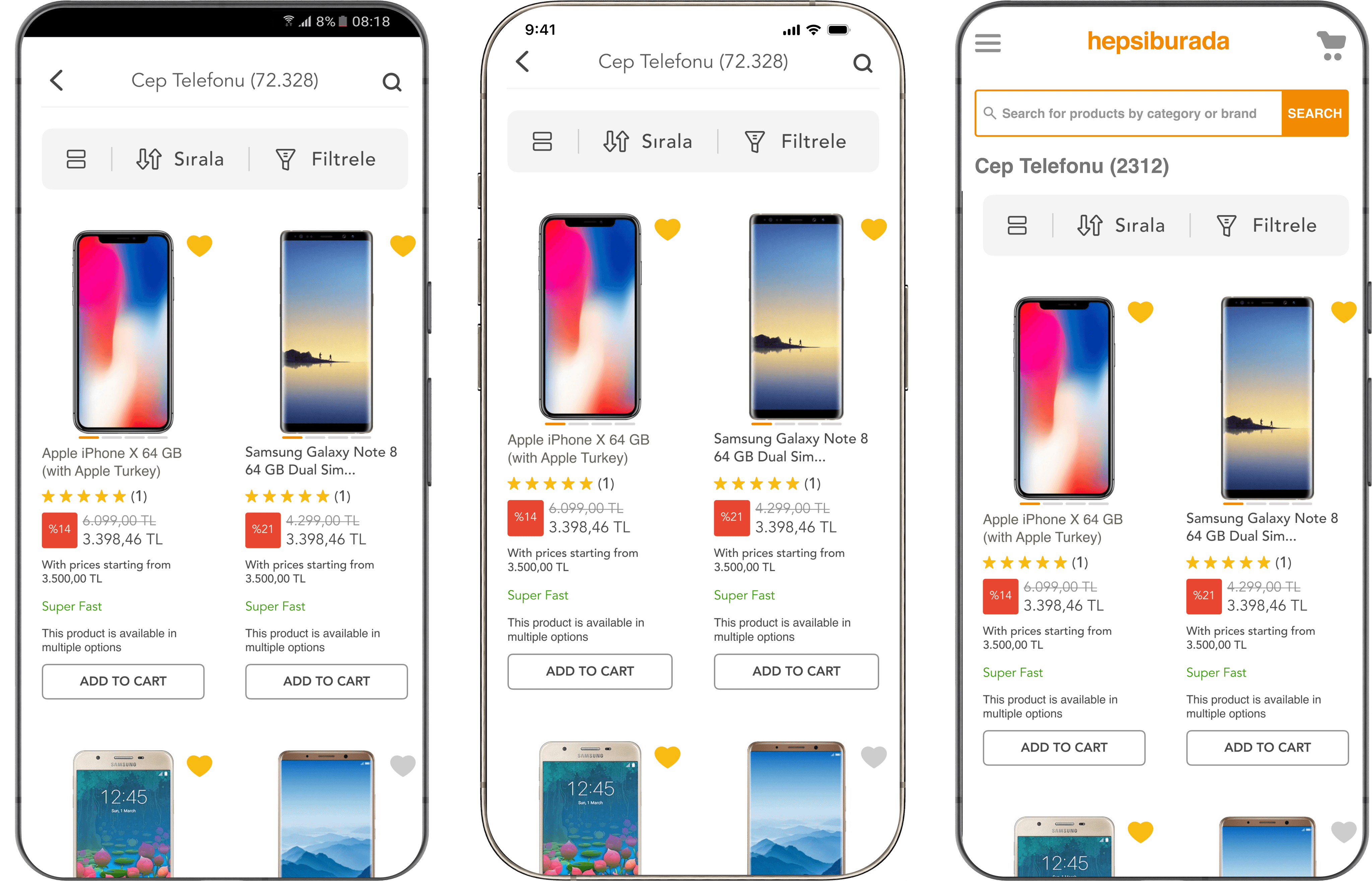
Hepsiburada Old Listing Pages: Android, iOS, and Mobile Web
There were several opportunities to improve the user experience on the listing page as described below:
Improving Usability of The Listing Pages: Noticed that the 'Add to Cart' function wasn't prominent enough for customers. Consequently, when users accidentally clicked on 'Add to Cart', they felt disoriented by being redirected to the variant selection page.
Enhancing the Average Time Spent and Number of Pageviews on the Listing Pages: Observed a lower average number of pages visited and time spent on the listing pages compared to our rivals such as Trendyol, n11, Amazon, Aliexpress and Gittigidiyor.
Increasing Findability: Our listing page exit rates were higher than those of our competitors based on Similarweb data.
Ensuring Consistent Mobile and Web Listing Page Experience: Addressed the lack of consistency in the mobile and web listing page experiences. Here are some examples where we had inconsistencies:
Some badges (super fast, extra discount) weren't available on the mobile web,
The discount rate design was implemented differently across all platforms,
Two grid views weren't available on the mobile web,
The appearance of mobile web filters and sorting is different from that of the Hepsiburada application.
Users and Audience
The platform receives 110 million total visits monthly, with approximately 70% of users being men. The majority of users fall within the 25-34 age range, and 60% of traffic originates from the mobile channel.
Scope and Constraints
The implementation of Google Design Sprint within our business demanded coordination among multiple departments with limited capacity and availability. To ensure success, I extended the sprint to two weeks, allowing us to balance sprint tasks with daily operations effectively. This adaptation showcased our ability to navigate constraints while maintaining focus on achieving our objectives.
The Process
Research And Understanding
I led the creation of a comprehensive benchmarking study, meticulously comparing our application and website with those of our competitors, followed by the collection of usability problems and research findings alongside our researcher.
Using these findings and insights as a base, I then facilitated a collaborative How Might We (HMW) workshop to turn those insights and challenges into opportunities for our design.
This approach ensured cross-functional teamwork and increased engagement through collaborative synthesis of insights and the development of actionable strategies to tackle identified challenges.
UI Design and Testing
Here are the improvements we made, along with the measured impact post-implementation.
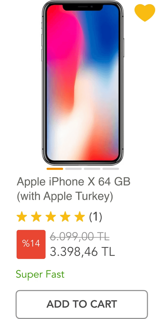
Improving Usability of The Listing Pages: We reimagined the 'Add to Cart' button, and displayed the variant selection as a bottom sheet.
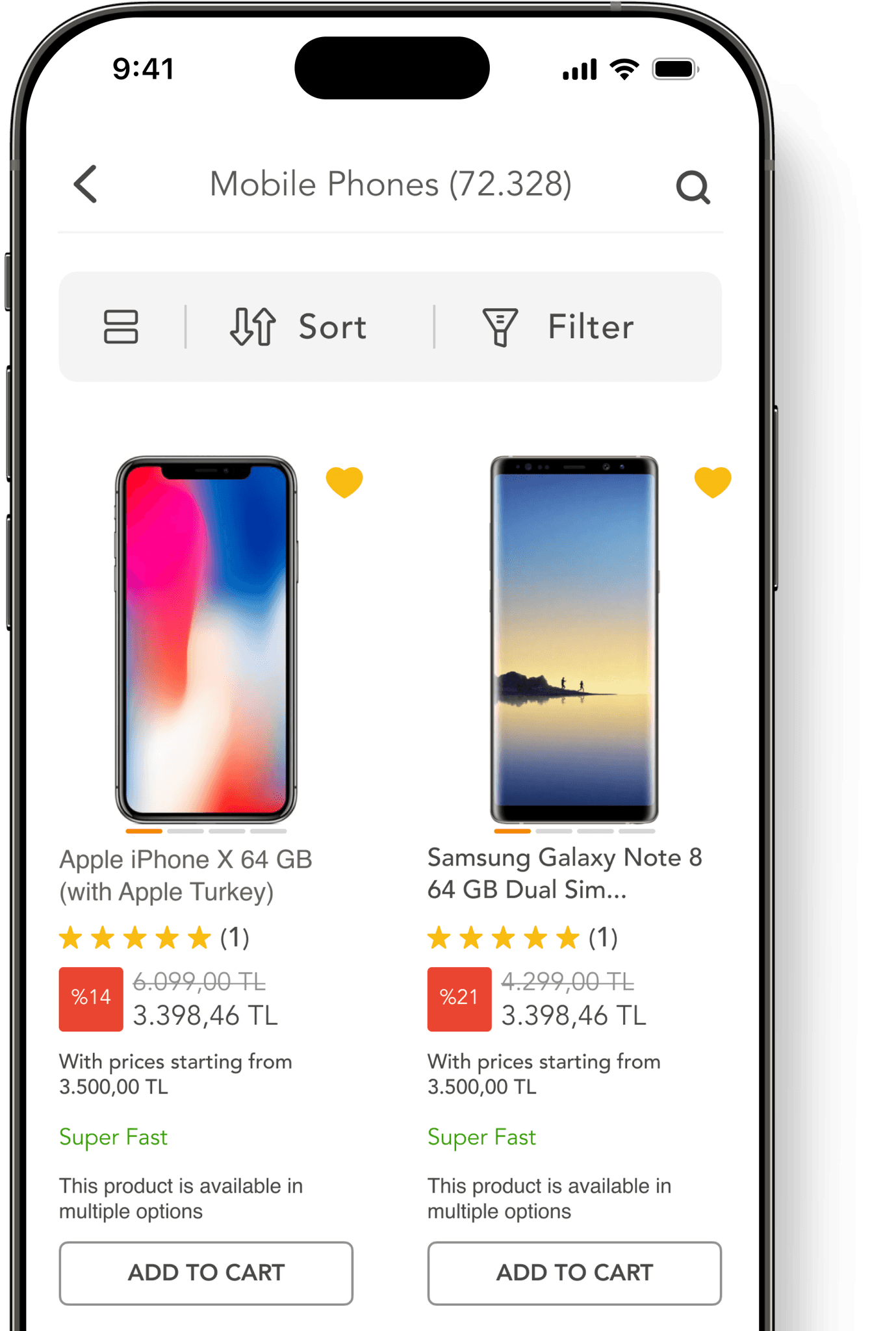
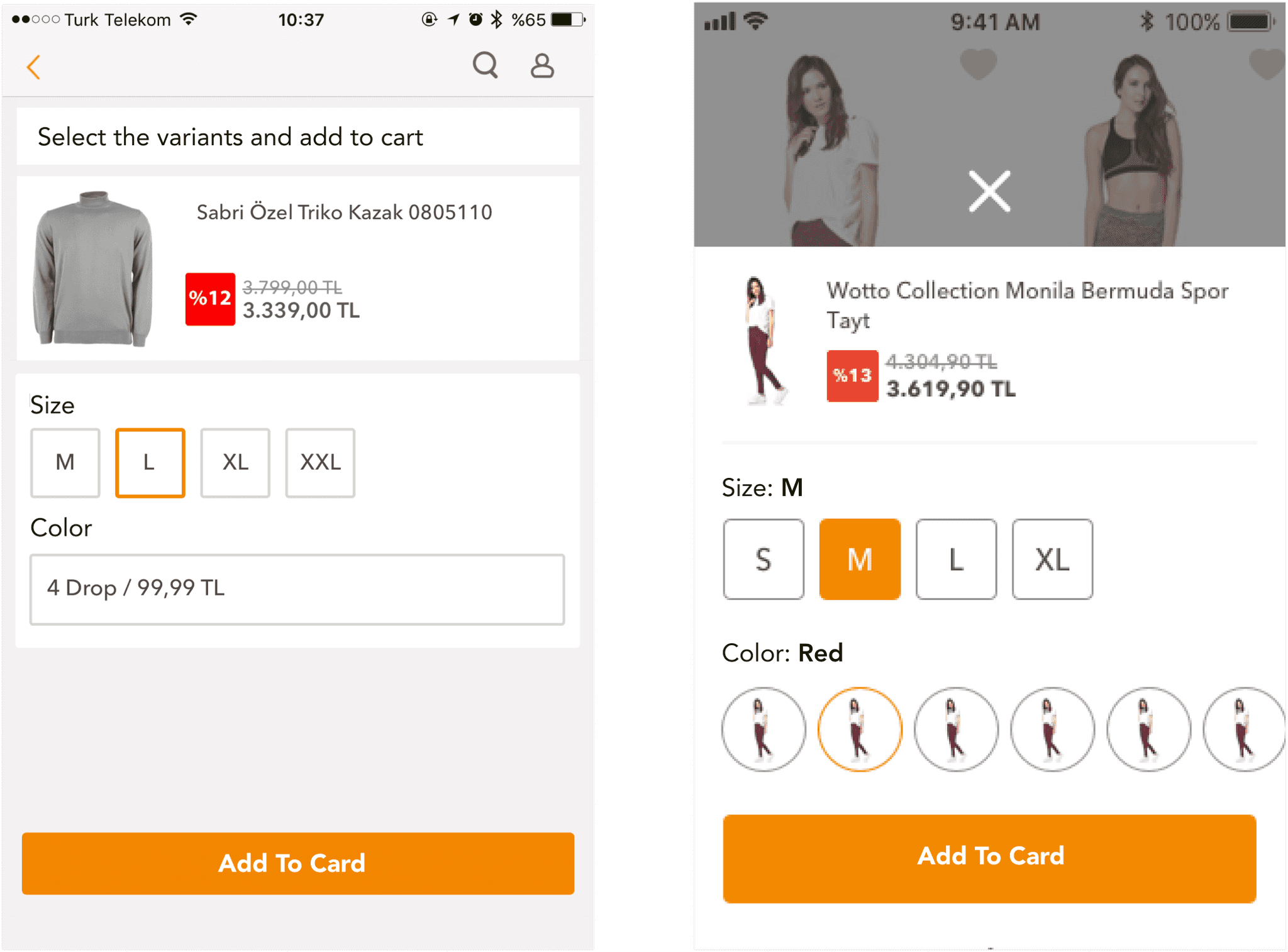
Add To Cart Button: In the initial design, the 'Add to Cart' function was represented solely by an icon. However, during user testing, we observed that users frequently tapped the icon unintentionally and struggled to identify its purpose. In order to improve user understanding and minimise accidental clicks, we redesigned the 'Add to Cart' functionality as a distinct button.
New
Old
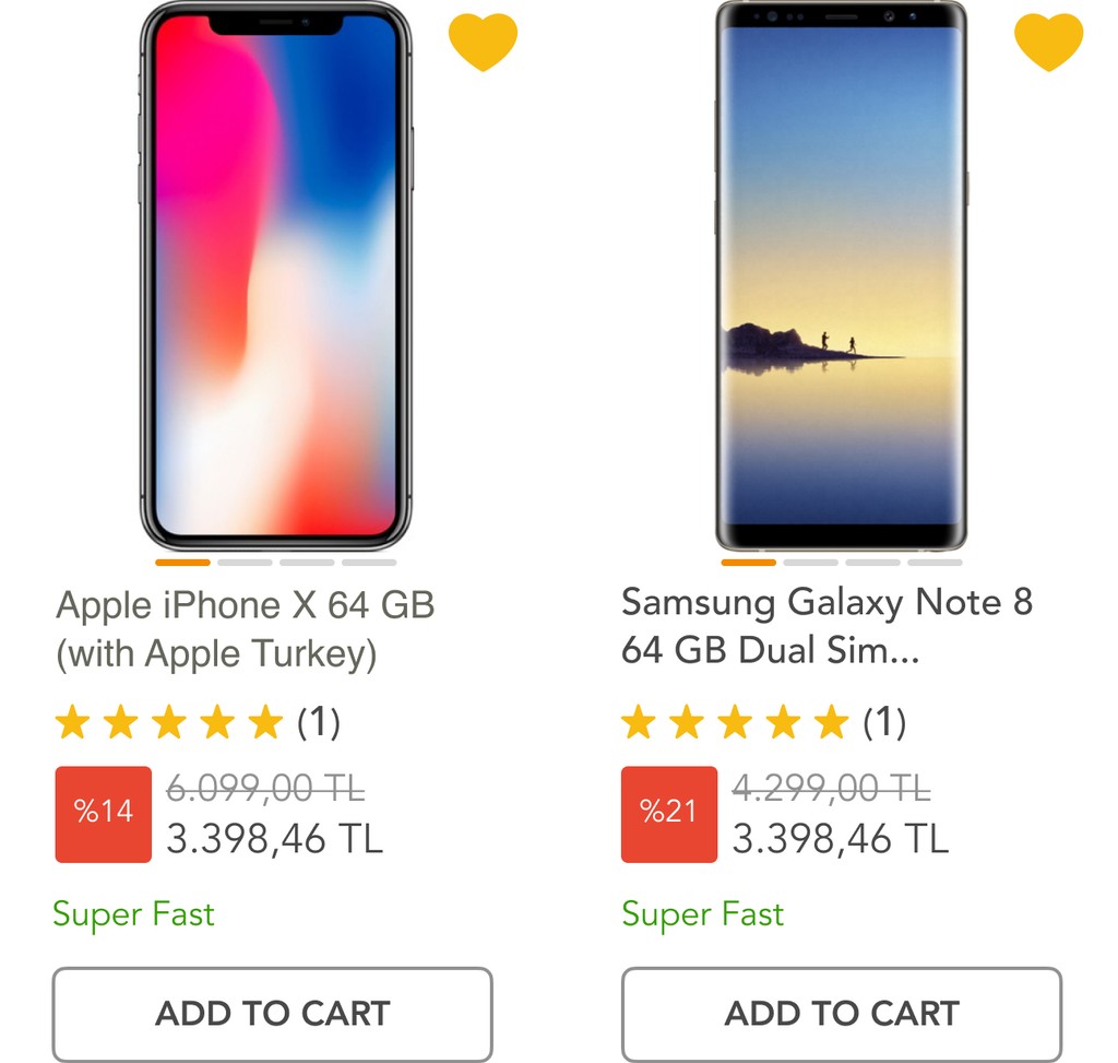
Success: Increased add-to-cart rate by 20% on the listing pages.
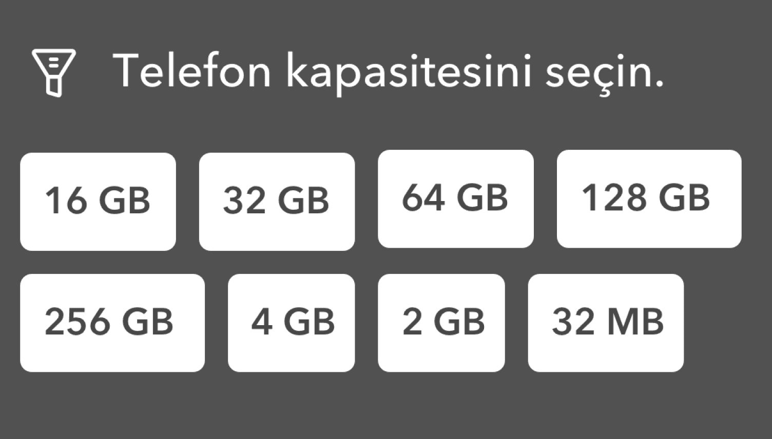
Variant Selection: When a product has variants, we display the variant selection as a bottom sheet to prevent distractions on the listing pages and ensure a seamless user experience.
In order to improve user understanding and minimise accidental clicks, we redesigned the 'Add to Cart' functionality as a distinct button.
New
Old
Achievement: The dropout rate on the variant selection page
fell by 8.5%.
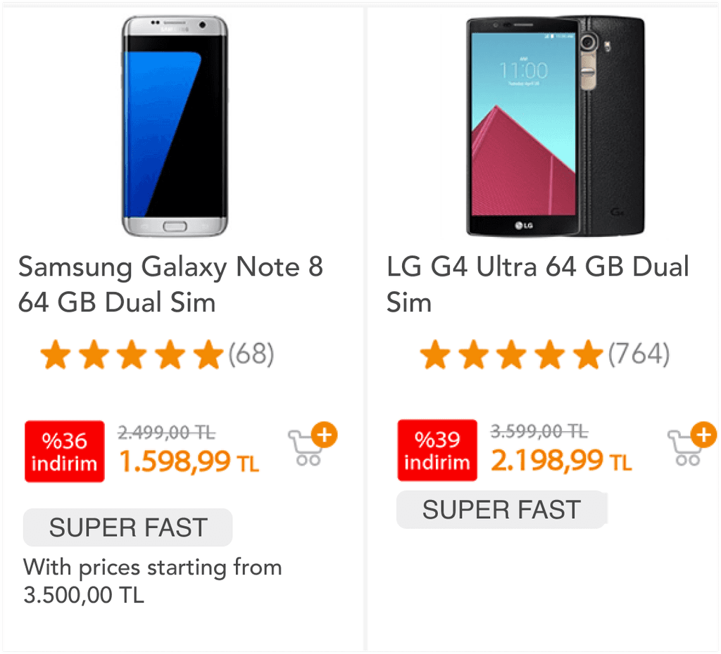
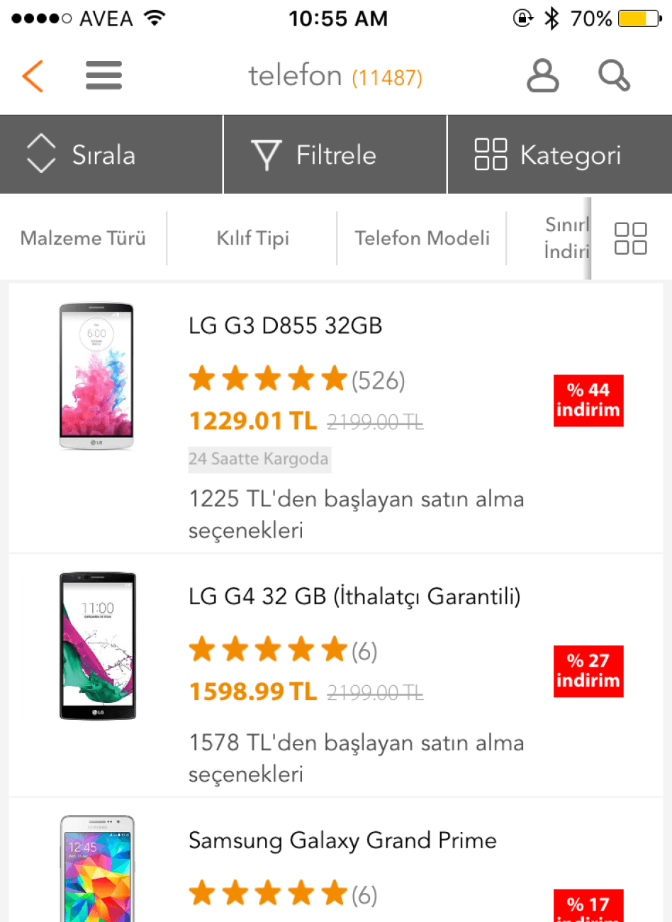
Improving Usability of The Listing Pages: We decided to implement infinite scroll and subcategory banners.
Infinite Scroll: Measuring the number of pages users browsed on the listing page and acknowledging the importance of the footer for SEO purposes, we decided to introduce infinite scroll for the initial four pages, transitioning to pagination thereafter.

New
Old
Success: The average page per visit increased from 3.71 to 4.71 on the mobile web.
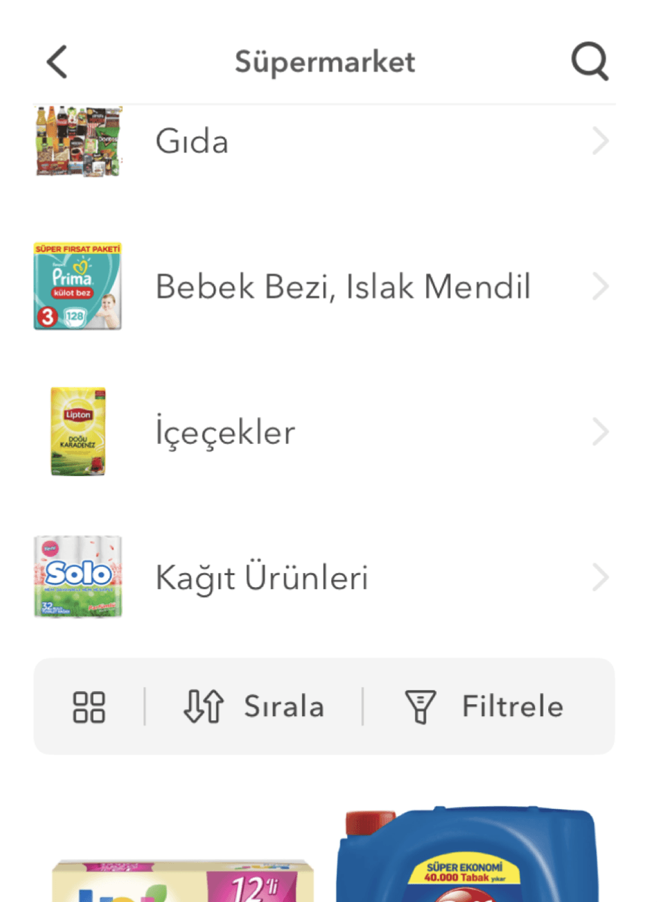
Subcategory Banners: The child categories received significantly more pageviews than the parent categories, with most users opting to click on the child categories when using the parent category filter. Therefore, we added subcategory banners to the category pages to improve user navigation and facilitate easier product discovery.
New
Old
Displaying Four Product Images in Product Box: We introduced a swipe gesture to allow users to view more images of the products they were interested in. Additionally, we implemented dashes to aid users in navigating through the images.
New
Old

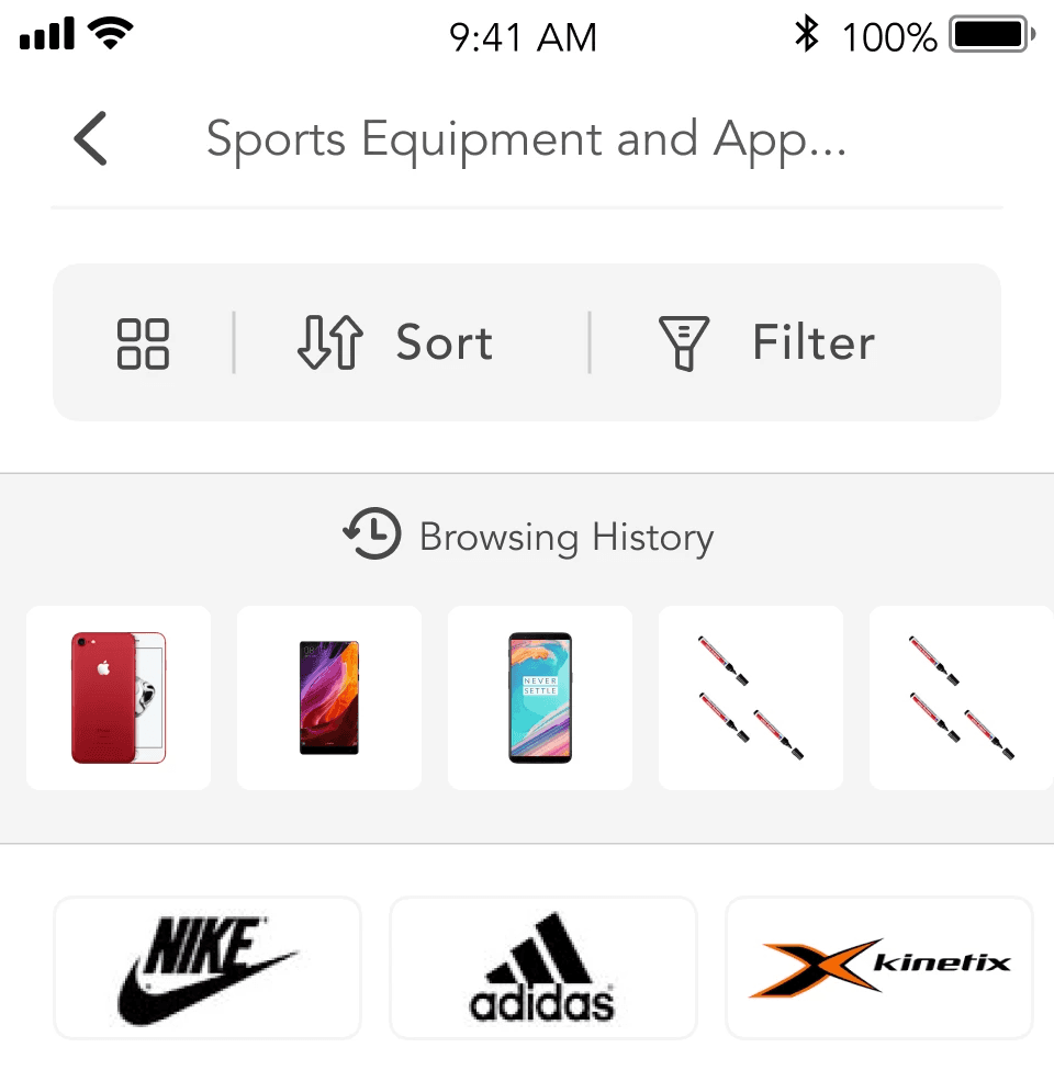
Increasing Findability: We introduced a “Quick Filter” module which contains the most used filters and the browsing history.
Quick Filter: We observed that users were scrolling extensively in the Android phone category, indicating they were searching for something but not finding it. To address this, we identified the most clicked attributes in the filter and implemented a Quick Filter in the Android phone category.
Success: Based on A/B test results, we saw a 6% reduction in exit rate on Android phone category pages, an 11% boost in filter attribute usage, and a 5% increase in views of product detail pages.
Browsing History: Users couldn't see the products they had looked at before. To address this, we added a collapsed browsing history page in the account menu.
Recommended Products for Free Shipping Eligibility: Upon analysis, we found that 29% of orders amounted to less than 75 TL, where shipping charges applied to these orders. In response, we strategized to enhance revenue and boost add-to-cart rates. As part of this initiative, we implemented a feature to recommend additional products when users add an item priced below 75 TL to their cart on the listing page.
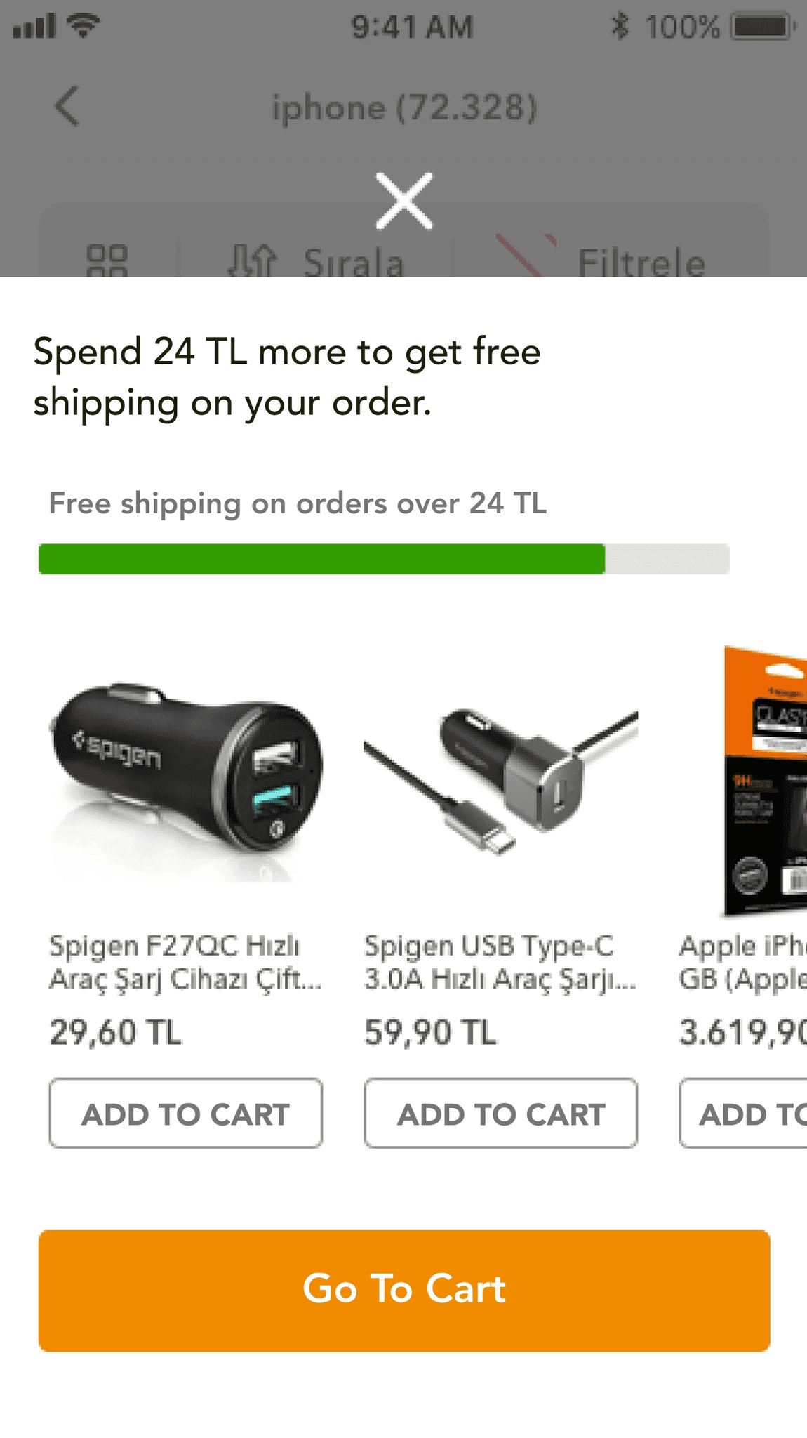
Success: Average Basket Size increased 7,14%.
Ensuring Consistent Mobile and Web Listing Page Experience: We noticed significant inconsistencies between the mobile web and app platforms, including differences in filter and sorting options, badges, headers, and the floating action button (FAB). To address this, we redesigned the mobile and web listing pages to ensure they offer the same functionalities.
Hepsiburada Old Listing Pages: Android, iOS, and Mobile Web
Hepsiburada New Listing Pages: Android, iOS, and Mobile Web
Outcomes & Lessons Learned
Collaborative design process: Observing a high level of enthusiasm among my colleagues for collaboration, I recognized the importance of working together. It became evident that producing solutions collaboratively not only addressed our issues effectively but also increased confidence in our collective work. This experience highlighted the value of inclusive idea development and decision-making processes.
Analytics: Through my experience, I have learned the importance of data in driving design decisions. One notable example is the "Recommended Products for Free Shipping Eligibility" feature. By analyzing order data, I discovered that 29% of orders incurred a shipping fee. This insight led to the development of a recommendation module aimed at encouraging users to add more items to their carts to qualify for free shipping. Consequently, we observed a 7.14% increase in the average basket size.
Decision making: I facilitated the creation of an Impact-Effort Matrix with a cross-functional team, including members from various departments. This collaborative approach streamlined the prioritization process and enabled transparent decision-making, ensuring that all stakeholders were involved and aligned.
Consistency: We faced numerous design inconsistencies across our applications, websites, and mobile web platforms which resulted from the absence of a cohesive design system. To tackle this, I led the creation of the design system utilizing Mobile and Desktop Guidelines. Throughout this experience, I learned the importance of effective communication and collaboration which were essential in successfully developing and implementing such a complex and holistic system.