n11 — Homepage & Discovery Experience Redesign

Overview
Role: Lead Product Designer
Scope: Mobile & Web
Team: Product, Engineering, Data, Marketing
Overview
The n11 homepage is a critical entry point for millions of users, yet it struggled with discoverability, personalization, and clarity. Users faced cognitive overload and generic content that failed to adapt to different needs—particularly for new users.
My Role
As the Lead Product Designer, I owned the UX strategy end to end. I defined the problem space, led design decisions, aligned stakeholders through data, and worked closely with cross-functional teams to deliver scalable and testable solutions.
The Challenge
Users didn’t know where to start on the homepage
Navigation and content hierarchy caused friction
Generic modules failed to address different user intents
New users lacked guidance and relevance early in the journey
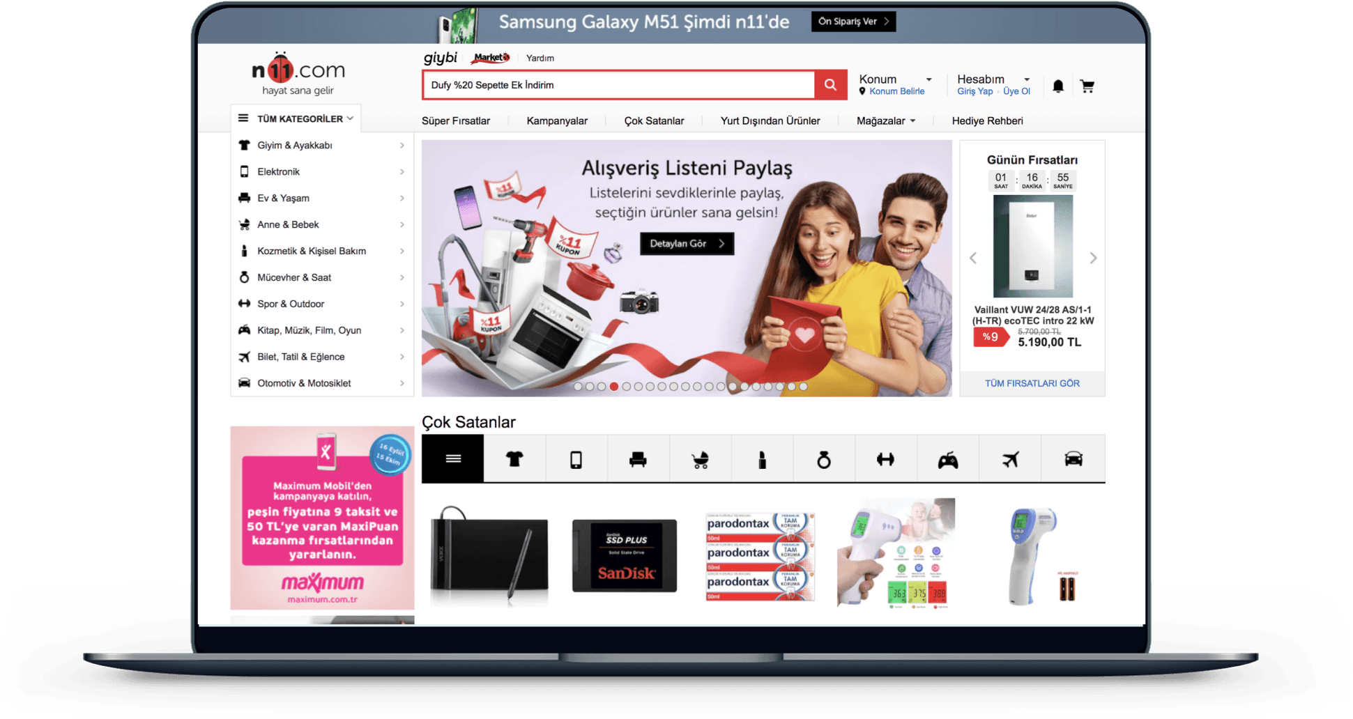
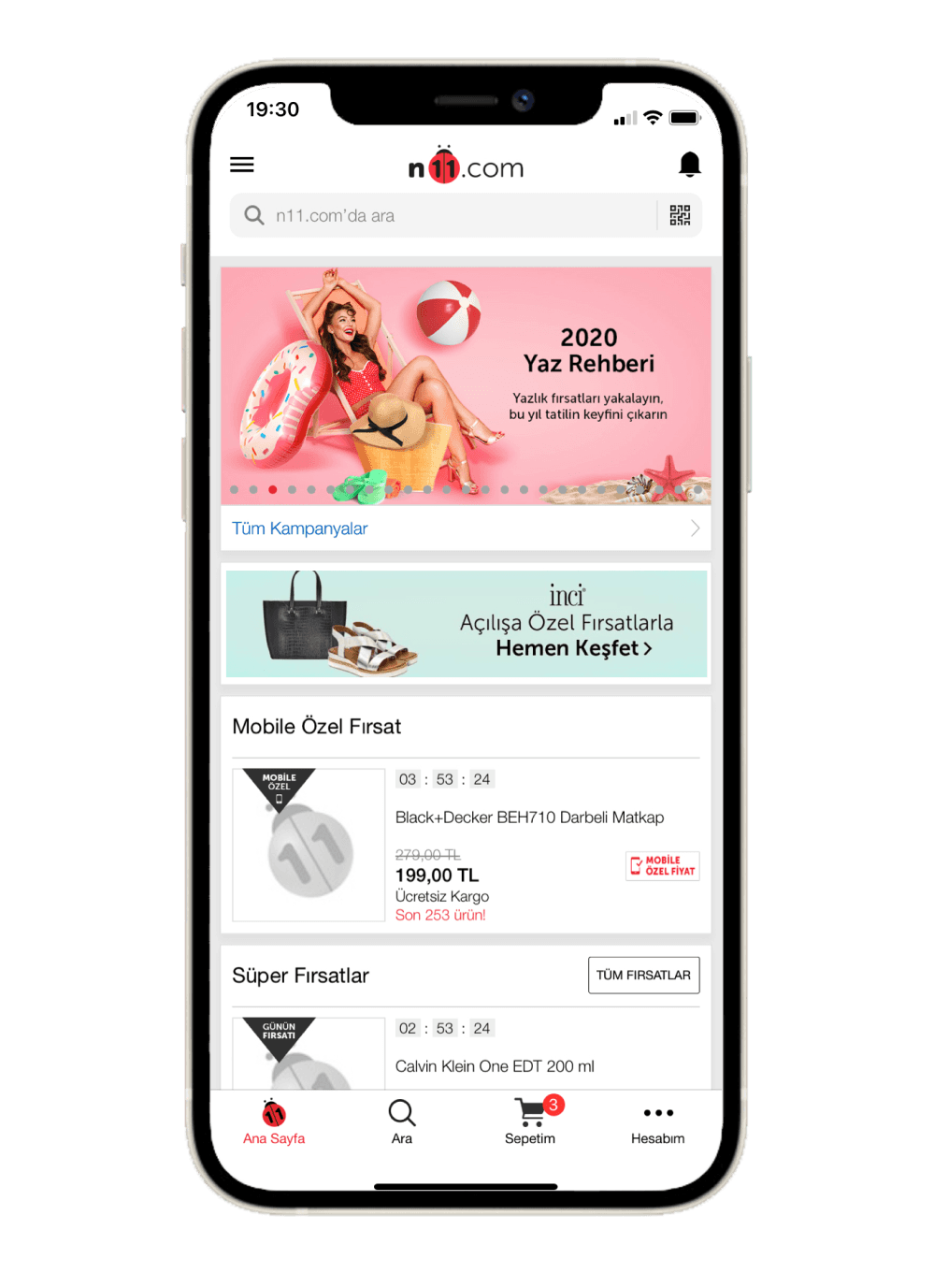
Old n11 Mobile and Desktop Design
Key Insights
Clear hierarchy matters more than content volume
Personalization must be contextual and intention-based
Reducing cognitive load directly improves engagement
Solution
Rebuilt the homepage hierarchy for clarity and scannability
Introduced intent-based and personalized content modules
Simplified navigation and module behavior
Iterated solutions through testing and data-driven refinement.
Impact

Homepage became one of the strongest drivers of discovery and engagement.
Key Learnings
Personalization only works when paired with strong information architecture
Data-informed decisions speed up alignment and reduce subjectivity
Senior design is about prioritization and measurable impact, not more features.
Read more
Research & Discovery
Objective
Understand why users struggled with homepage discoverability and relevance.
Objective
Usability testing with 30 participants
Funnel and behavior analysis using Google Analytics
Heatmap and click analysis
Competitive benchmark review
Key Findings
Users felt overwhelmed by content density
Navigation patterns were inconsistent across modules
Personalization was perceived as random rather than helpful
User Segmentation & Needs
Instead of relying on static personas, we focused on behavior-based user segments:
New users: Needed guidance and clarity
Returning users: Expected speed and relevance
Deal-oriented users: Looked for shortcuts and visibility.
This segmentation helped prioritize solutions that scaled across high traffic.
Problem Definition (How Might We)
Based on research insights, we framed the problem with the following questions:
How might we help users understand where to start?
How might we surface relevant content without increasing cognitive load?
How might we balance personalization with clarity and trust?
Early Explorations & Iterations
We explored multiple homepage structures focusing on:
Content hierarchy
Module behavior
Navigation clarity
Low-fidelity wireframes were tested internally and with users to validate assumptions before moving into high-fidelity designs.
Key Design Decisions
Decision 1 — Modular Homepage Structure
Why: Static layouts limited flexibility and experimentation
What: Introduced modular, interchangeable content blocks
Impact: Enabled scalable personalization and faster iteration
Decision 2 — Intent-Based Content
Why: Generic modules failed to match user expectations
What: Designed content based on user intent rather than category lists
Impact: Increased relevance and engagement
Decision 3 — Simplified Navigation Patterns
Why: Users felt lost within complex navigation
What: Reduced navigation complexity and clarified entry points
Impact: Lower cognitive load and improved discoverability
Testing & Validation
A/B testing on selected homepage modules
Qualitative usability testing
Post-launch behavior tracking.
Insights from testing directly informed final refinements.
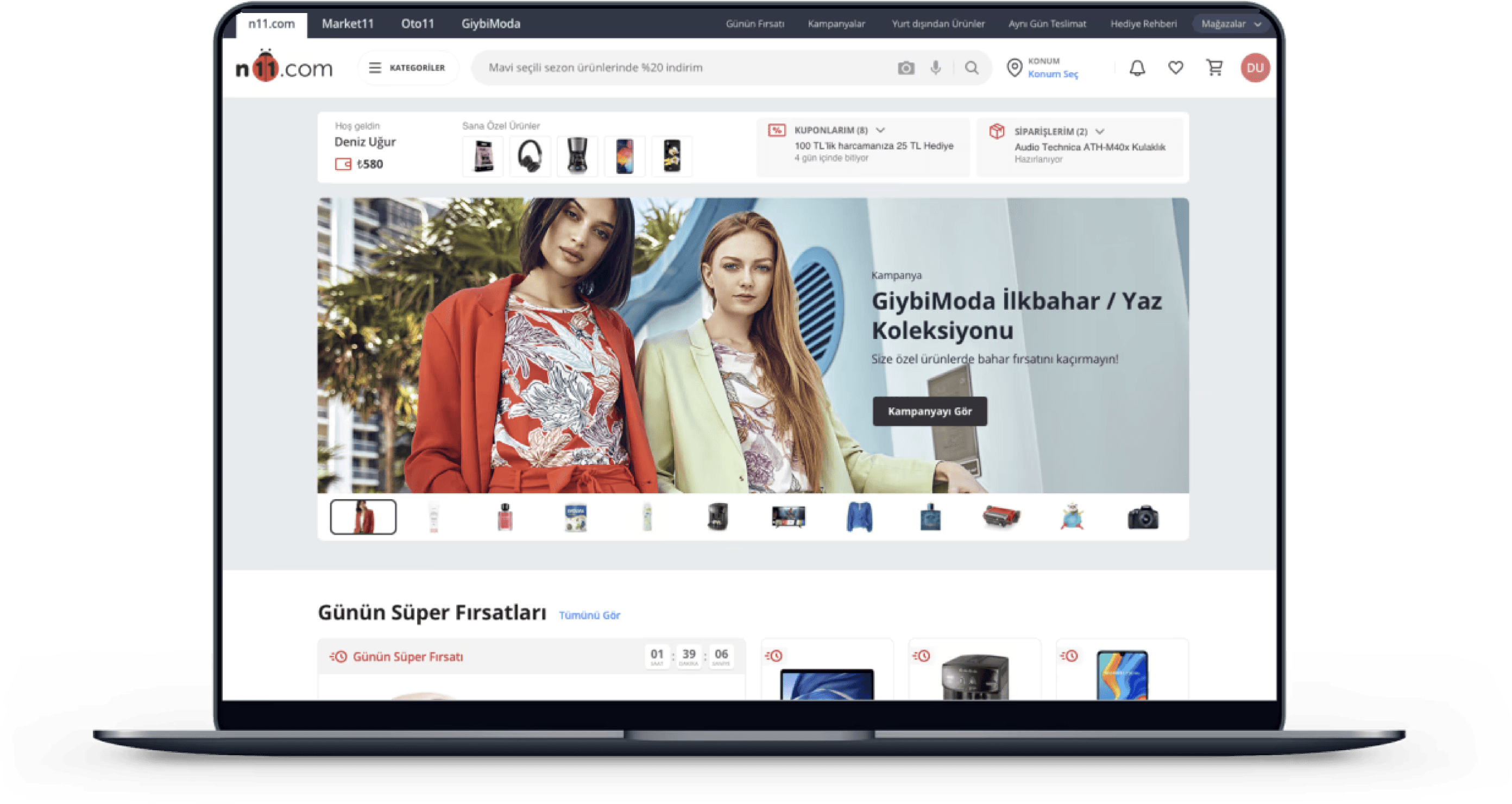
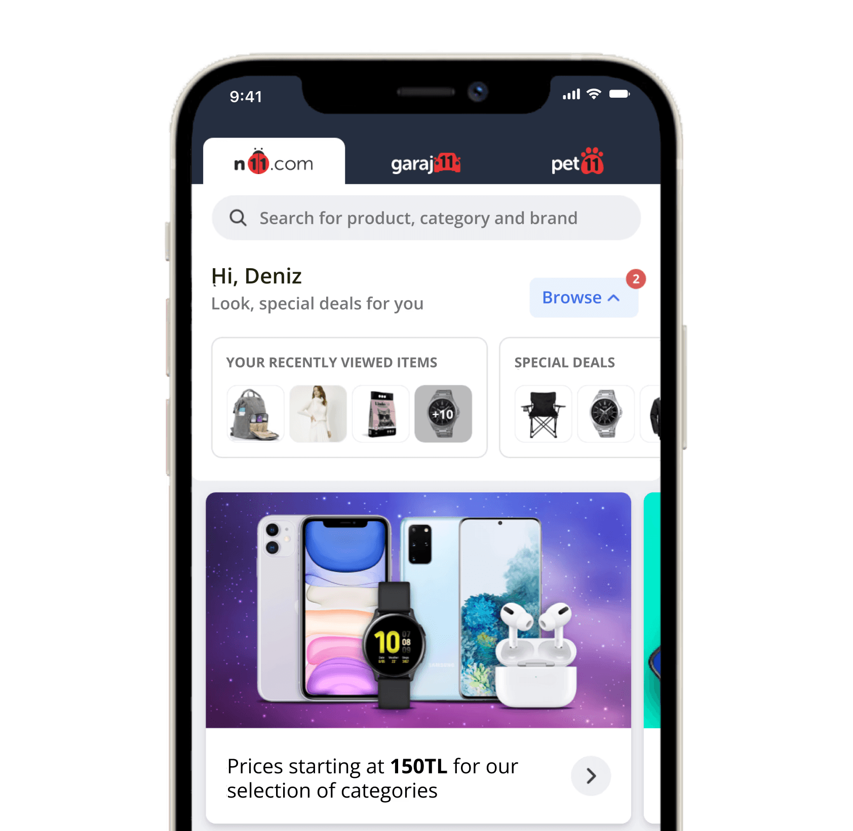
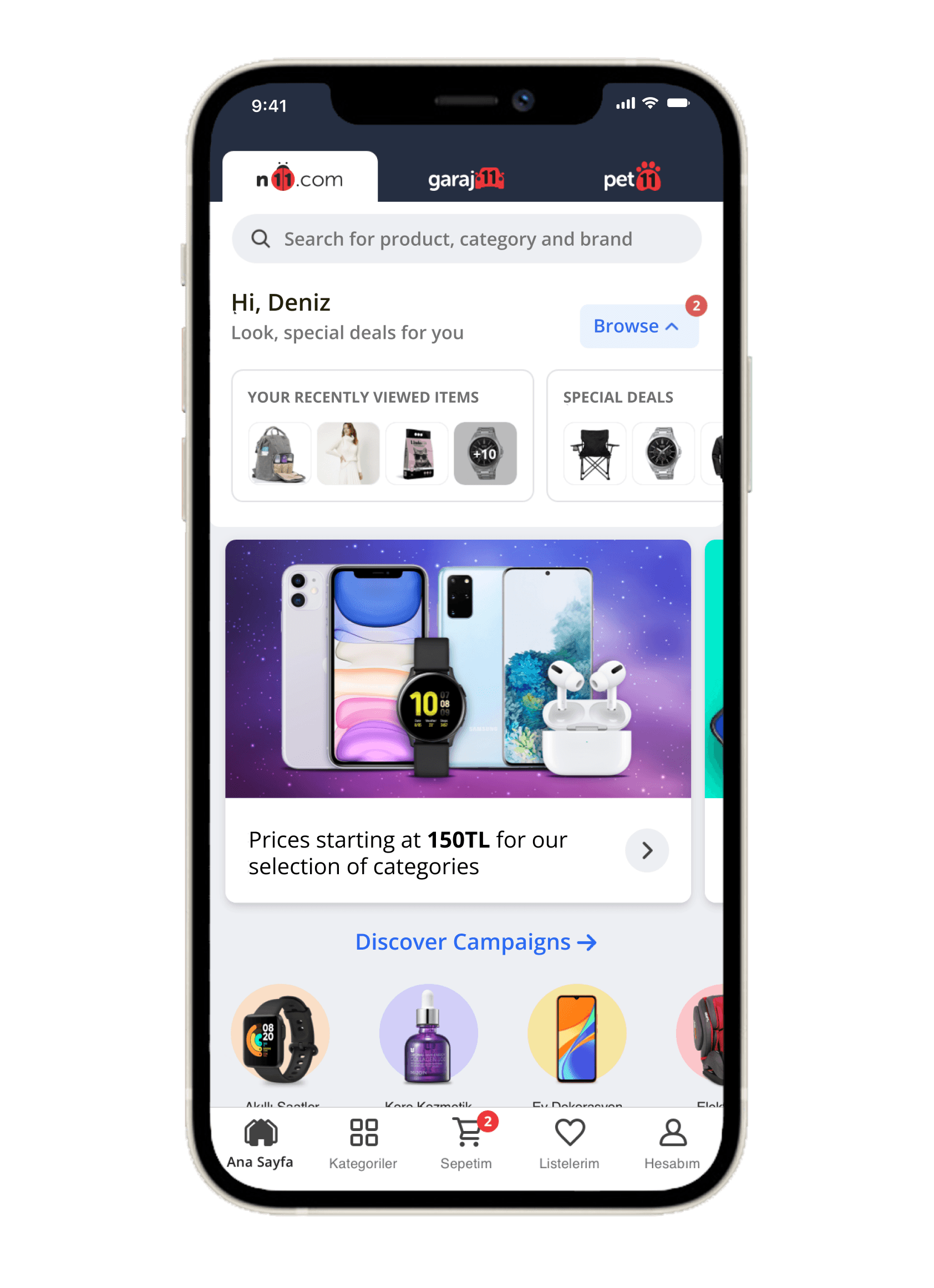
Final Designs
A/B testing on selected homepage modules
Qualitative usability testing
Post-launch behavior tracking.
Insights from testing directly informed final refinements.
Impact
Homepage became one of the strongest drivers of discovery and engagement.


N11 Home Page
Revamp


Overview
Role: Lead Product Designer
Scope: Mobile & Web
Team: Product, Engineering, Data, Marketing
Overview
The n11 homepage is a critical entry point for millions of users, yet it struggled with discoverability, personalization, and clarity. Users faced cognitive overload and generic content that failed to adapt to different needs—particularly for new users.
My Role
As the Lead Product Designer, I owned the UX strategy end to end. I defined the problem space, led design decisions, aligned stakeholders through data, and worked closely with cross-functional teams to deliver scalable and testable solutions.
The Challenge
Users didn’t know where to start on the homepage
Navigation and content hierarchy caused friction
Generic modules failed to address different user intents
New users lacked guidance and relevance early in the journey


Old n11 Mobile and Desktop Design
Key Insights
Clear hierarchy matters more than content volume
Personalization must be contextual and intention-based
Reducing cognitive load directly improves engagement
Solution
Rebuilt the homepage hierarchy for clarity and scannability
Introduced intent-based and personalized content modules
Simplified navigation and module behavior
Iterated solutions through testing and data-driven refinement.
Impact

Homepage became one of the strongest drivers of discovery and engagement.
Key Learnings
Personalization only works when paired with strong information architecture
Data-informed decisions speed up alignment and reduce subjectivity
Senior design is about prioritization and measurable impact, not more features.
Read more
Research & Discovery
Objective
Understand why users struggled with homepage discoverability and relevance.
Objective
Usability testing with 30 participants
Funnel and behavior analysis using Google Analytics
Heatmap and click analysis
Competitive benchmark review
Key Findings
Users felt overwhelmed by content density
Navigation patterns were inconsistent across modules
Personalization was perceived as random rather than helpful
User Segmentation &
Needs
Instead of relying on static personas, we focused on behavior-based user segments:
New users: Needed guidance and clarity
Returning users: Expected speed and relevance
Deal-oriented users: Looked for shortcuts and visibility.
This segmentation helped prioritize solutions that scaled across high traffic.
Problem Definition
(How Might We)
Based on research insights, we framed the problem with the following questions:
How might we help users understand where to start?
How might we surface relevant content without increasing cognitive load?
How might we balance personalization with clarity and trust?
Early Explorations &
Iterations
We explored multiple homepage structures focusing on:
Content hierarchy
Module behavior
Navigation clarity
Low-fidelity wireframes were tested internally and with users to validate assumptions before moving into high-fidelity designs.
Key Design Decisions
Decision 1 — Modular Homepage Structure
Why: Static layouts limited flexibility and experimentation
What: Introduced modular, interchangeable content blocks
Impact: Enabled scalable personalization and faster iteration
Decision 2 — Intent-Based Content
Why: Generic modules failed to match user expectations
What: Designed content based on user intent rather than category lists
Impact: Increased relevance and engagement
Decision 3 — Simplified Navigation Patterns
Why: Users felt lost within complex navigation
What: Reduced navigation complexity and clarified entry points
Impact: Lower cognitive load and improved discoverability
Testing & Validation
A/B testing on selected homepage modules
Qualitative usability testing
Post-launch behavior tracking.
Insights from testing directly informed final refinements.
Final Designs
A/B testing on selected homepage modules
Qualitative usability testing
Post-launch behavior tracking.
Insights from testing directly informed final refinements.
Impact
Homepage became one of the strongest drivers of discovery and engagement.

