Save For Later


Project Overview
Hepsiburada is Turkey’s second-largest online store offering approximately 180 million products across 32 categories, connecting approximately 50 million members with a growing base of more than 100,700 active merchants.
My Role
I managed the design of the Save For Later feature alongside a researcher and two UX designers. My responsibilities included benchmarking, data collection, prototyping the user flow, creating wireframes, and designing the UI. Additionally, I collaborated with the researcher to manage guerrilla testing, ensuring we gathered valuable user feedback.
The Problem
There were several opportunities to improve our shopping cart experience by enabling our customers to save products for later:
Loss of Selected Items: Users who want to continue shopping later lose the items they were interested in.
Increased Cart Abandonment: Users may add items to their cart as a way of "saving" them, but without a proper "Save for Later" feature, they may abandon the cart if they are not ready to purchase immediately.
Users and Audience
The platform receives 110 million total visits monthly, with approximately 70% of users being men. The majority of users fall within the 25-34 age range, and 60% of traffic originates from the mobile channel. Users weren't able to find the products they had deleted from the cart, so they looked for a way to find those products.
Scope and Constraints
It was a big challenge to add this feature. When I compared Hepsiburada’s cart page to competitors, I noticed they use checkboxes to choose the products that users want to buy. There were two ways to implement the feature. The first version included the "Save for Later" function supported with an edit feature and a checkbox that allows users to choose the products they want to buy from the cart page. The second version only used the "Save for Later" button for every product in the cart. It was risky to proceed without validating it. Given the limited time to deliver the feature, I collaborated with the team and decided to validate the two versions using Guerilla Testing. I designed and prototyped the two versions in a short time, which helped us make the right decision.
Moreover, splitting the payment amount into two parts introduced new challenges, requiring us to account for different cases. Another critical decision involved selecting the appropriate form validation method. We considered three approaches: validating inputs in real-time as users typed, validating each form field as users completed and moved to the next one, and automatically adjusting the split payment amount to match the order total, even if it was higher or lower. Our goal was to take the best possible approach without disrupting the transaction process.
The Process
Research And Understanding
When conducting a benchmarking study, it stood out to me that leading e-commerce platforms like Amazon, Flipkart, Walmart, Trendyol, eBay, and n11 employed two distinct design approaches to enable their customers to save products for later. Getting inspired by them, it was all about determining the approach that would best suit our needs. To facilitate a quick brainstorming and an informed decision making, I collaborated with my team to map out the user flows for each possible version. This collaborative effort enabled us to select the most effective design strategy, which we then translated into prototypes.
Leading the user testing process with valuable guidance from our user researcher, I honed my skills in conducting effective user tests. This experience not only deepened my expertise in user testing but also solidified my research capabilities, which I continue to apply and refine in my ongoing work.
To complement our qualitative research, we integrated product analytics into our decision-making process. By leveraging Google Analytics, we tracked how often users deleted products from their carts.
UI Design and Testing
Following our comprehensive research and deep understanding of user needs, we began by defining the user flows, which streamlined the design process. Based on these flows, we developed two prototypes for testing:
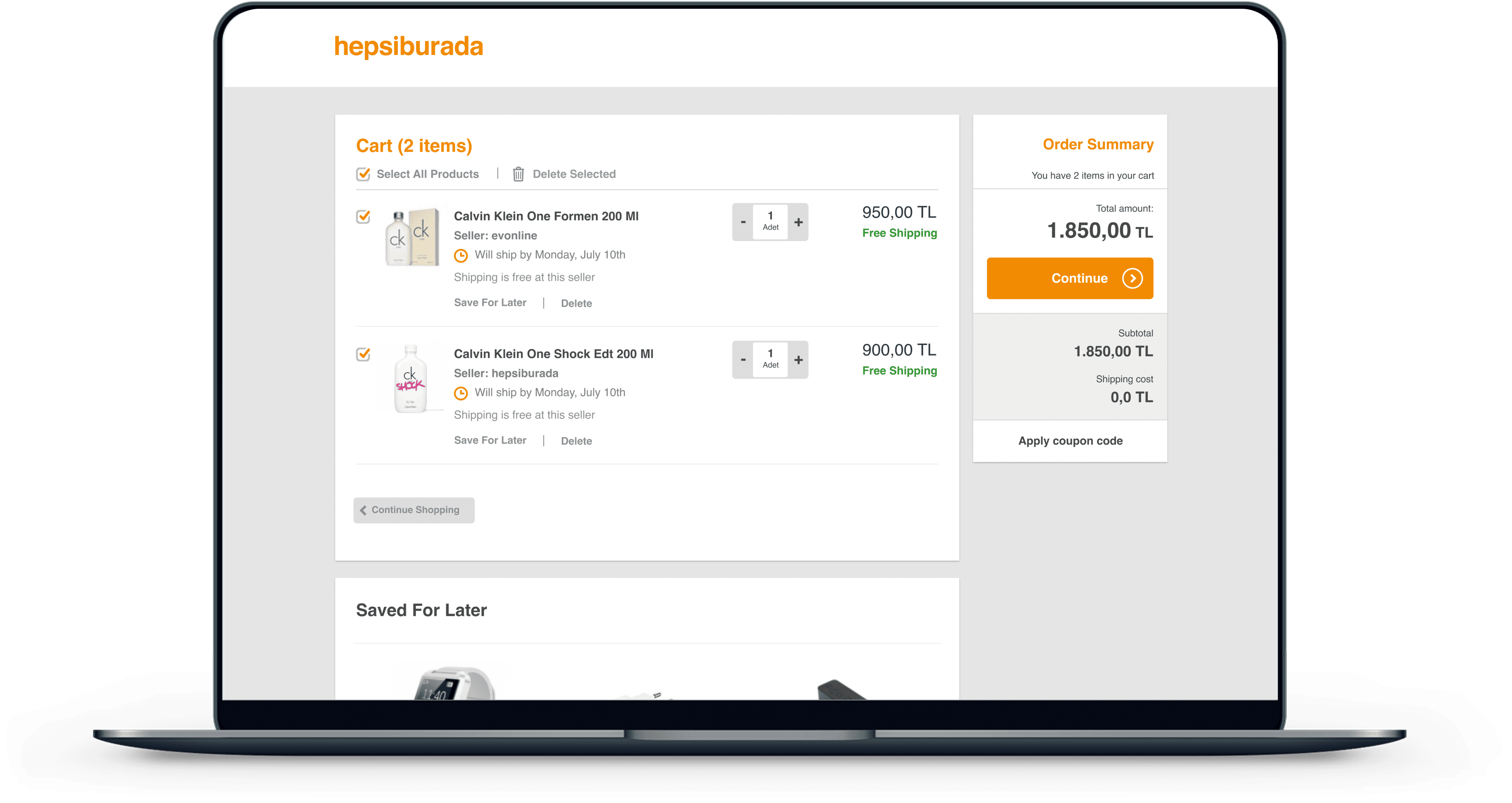
Product box with checkbox, save for later, and delete button: This version uses checkboxes to select the products that users want to buy or delete. It was commonly found on international e-commerce sites.

Product Box With Checkbox, Save For Later, And Delete Button
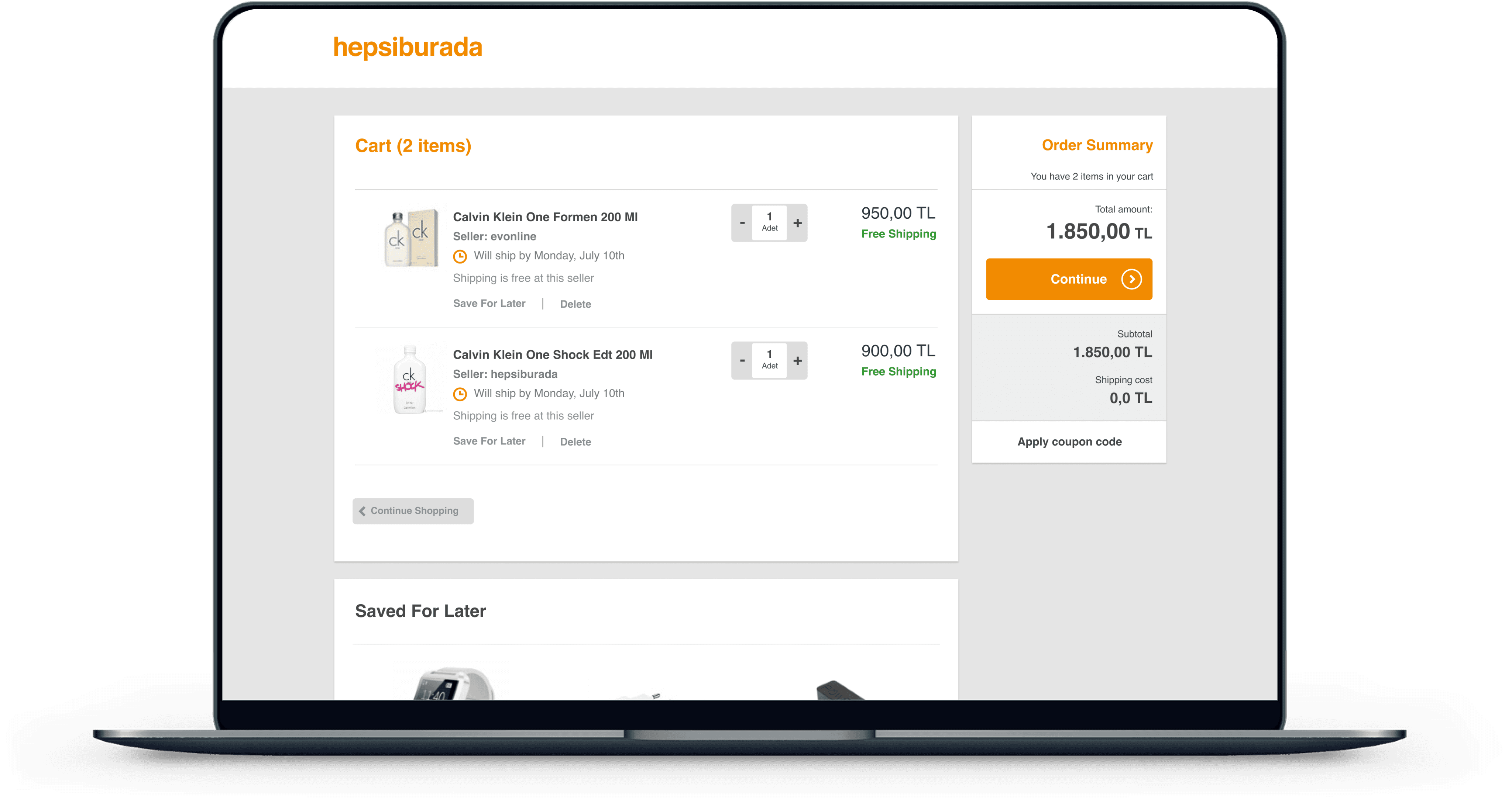
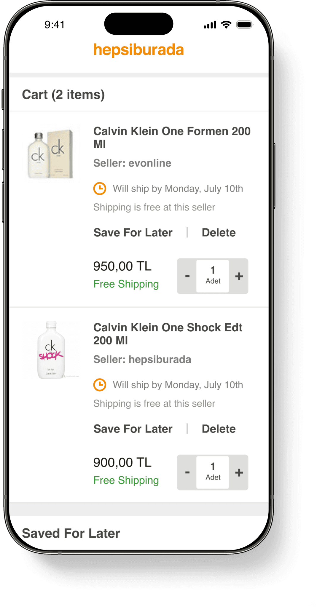
Product box only with save for later and delete button: In this version, the delete or save for later functions are integrated within the product box itself. This approach was more common on domestic e-commerce sites.

Product Box Only With Save For Later, And Delete Button
With our two prototypes ready, we conducted user tests with 12 participants. Each prototype was tested by 6 participants, 3 of them being Hepsiburada users and the remaining 3 being non Hepsiburada users.
At that time the test results showed that the second option which was the product box only with save for later and delete button was more intuitive and easier for participants to understand. Based on these findings, we designed the basket page for the web, mobile web, and apps.
Outcomes
Enabling users to save products for later had a significant impact:
Increasing findability: The "Save for Later" list became the third most visited page in the "My Account" section and the
Increasing the add-to-cart rate from the "Save for Later" list: "Move to Cart" (Add to Cart) button became the third most used button.
Decreasing the number of deleted cart items: The percentage of items deleted from the basket decreased from 33% to 21%.
The cart abandonment rate dropped significantly.
Note: Although we initially implemented the second option with a product box featuring only the "Save for Later" and "Delete" buttons, user behaviour evolved over the next three years. Users began to expect more decision-making capabilities on the cart page, such as adding products and comparing prices. This shift prompted us to revisit our design strategy and re-design the experience using a checkbox approach.
Lessons Learned
Collaborative Design: One of the highlights of this initiative was the close cross-functional team collaboration. Working closely with the team not only led us to the best design solutions that created delightful experiences for users but also ensured that everyone was aligned with the project's direction. This collective awareness of current and upcoming tasks created a more cohesive and efficient workflow.
Validation Through User Testing: Validating designs through user testing and especially leveraging guerrilla testing was essential to our process. When faced with decision-making challenges, conducting quick guerrilla tests allowed us to gather immediate feedback and make informed decisions. This approach significantly accelerated the design process, helping us maintain momentum without sacrificing quality.
Product Analytics and User Insights: A key technical skill I gained throughout this initiative was using Google Tag Manager to collect user data independently without relying on any engineering effort. By integrating this practice, we were able to validate our designs in a more streamlined and efficient manner.